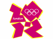
 The Olympics are coming to London in 2012 and as a life-long Londoner and Olympics fan I couldn't be more excited or prouder. The logo on the left says everything that I feel about the Olympics in London, it's vibrant, it's got the Olympic colours, it says London in letters and shapes. All the elements work together to say what's important - London and Olympics.
Unfortunately, this is not the logo of the London Olympics, it's the logo they used for the bid process. Instead they spent a few hundred thousand pounds (I heard 400k, but I suspect it's a lot more than that) coming up with this.
 The logo was launched with all the pretentious marketing-ese that is to be expected. Seb Coe said "It will define the venues we build and the Games we hold and act as a reminder of our promise to use the Olympic spirit to inspire everyone and reach out to young people around the world". Tony Blair said "When people see the new brand, we want them to be inspired to make a positive change in their life". The People said "Blergh".
Skipping all the pretentious 'what the brand reflects' stuff, it's just an ugly logo. The colours are non-specific 'bluey grey', 'reddy pink', 'greeny-turquoise' and, well, orange; all over an insipid yellow drop shadow. Even the official website isn't using the colours. The shapes don't really look like anything and are just crying out for people to doodle over the logos and make new shapes.
Drifting into marketing psychology, I wouldn't have automatically linked a jagged image with generating a feeling of inclusiveness. But then I'm not a disengaged teenager, which appears to be the principal target. By trying to appeal to a younger audience, they have managed to repulse everyone else. I haven't actually seen any comments on teenager response but grown-ups seem to really hate it. Even marketing experts are dubious.
So why have they gone with such an unpopular choice? The only options seem to be that they either didn't do any research with 'normal' people, their test group didn't reflect popular opinion or they just ignored the feedback. All those options are a bit concerning. But the message they are sending is that they're targeting a very specific demographic (and is that really a demographic that is bought/lost by a logo?) and don't care what anyone else thinks. That's the Olympic Spirit!
2 comments:
the 2s do look like a stylised Britain.
*squint* yes, I guess they sorta do...
*twists head sideways*
Post a Comment